Wow, the feedback...awesome. Great motivation....
RE: TTK Sample Minifig
Awesome! That turned out really good! I'm wondering if I need to lower the eyes a bit? Any feedback on placement is appreciated - it helps me calibrate.
RE: RedBean
Thanks for the kind words. I've always thought your designs were stellar and have found myself visiting your site with each design I make - for inspiration and reference.
Your words go a long way.
RE: Capes
Cloth capes/cloaks might be too difficult to handle. I did locate some light paper/canvas material that might be suited well for this though. We'll see how the LaserJet reacts to it.
RE: Minifig Design
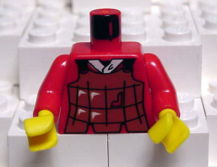
Too much rendering and too much detail was a concern of mine. As most of you know I already have 100 designs that do not contain any shading/rendering - very "Legoesce".
Much like:
http://www.peeron.com/pics/inv/custpics/973px15.jpg
Then I decided to experiment with gradients on some various LoTR designs and thought they turned out pretty good. My goal was to step "out of bounds" - like TLG did with torsos such as:
http://www.peeron.com/pics/inv/custpics/973px12.jpg
I'm currently having a lot of fun with gradients and probably won't revert back unless the design dictates. The other factor is they print out perfect on my LaserJet (no detail loss).
RE: Other designs
I will definitely start fooling around with putting my roman designs (and other designs) online for download. The laser printouts will probably be somewhere around $5 @.
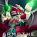
I do have examples of Roman designs in my BS account
http://www.brickshelf.com/cgi-bin/gallery.cgi?m=armothe
-A
Lord of the Rings - TTT - Uruk Hai
-
TwoTonic Knight
- TwoTonic of Many Colors
- Posts: 1815
- Joined: Thu Dec 04, 2003 11:33 pm
- Location: The Lowest Pit of Megablocks
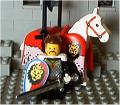
Eye placement seems okay. It depends on how far the head sticker is binding the helmet from seating down all the way. The photo was done with rather harsh single-source lighting - I prefer to shoot during daylight hours or at least use two light sources - so there is a strong shadow from the rim of the helmet that perhaps make the eye look too high.armothe wrote:
RE: TTK Sample Minifig
Awesome! That turned out really good! I'm wondering if I need to lower the eyes a bit? Any feedback on placement is appreciated - it helps me calibrate.
The real problem is with the shield for both Gil-Galad and the Uruk. They are a shade too small. I transfered yours on top of one of Anthony's because those are perfectly sized for the oval shield - I have to switch from 500 to 300 dpi, but that's no problem with the actual size locked. About 10 pixels short top to bottom, upper sides are short, bottom sides match. The pictures of the Uruk won't show it as bad because I glued that to an unBrassoed Bull shield, so the dark edge helps hide it, but for the Gil-Galad shield on a Brassoed white shield it is very obvious that the sticker comes up short.
Redwine the Ribald: Stare long enough into the abyss...
Two-Tonic Tippler: ...and you spit into it.
[img]http://www.brickshelf.com/gallery/corsair/C ... ippler.jpg[/img]
Two-Tonic Tippler: ...and you spit into it.
[img]http://www.brickshelf.com/gallery/corsair/C ... ippler.jpg[/img]
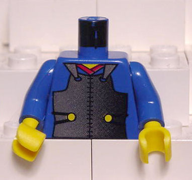
Here is just a comparison between the two methods:Red Bean wrote:Actually, this might be a start of a good debate. The design of sets have certainly been talked about before, let's talk about the design of minifigs this time!!

Both have their individual merits. Maybe its just up to personal preference?
-A
-
wlister
- Sheriff
- Posts: 1562
- Joined: Tue Sep 16, 2003 1:40 pm
- Location: There be no castles here.
- Contact:
I like them both. They both have merits and as long as you didn't line them up side by side like that in a MOC, I think either would fit the Lego world just fine. The highly detailed breastplate in KKI works just fine with the plain chain mail torso from the Royal Knight or Black Knight era. We have see torso printing evolve greatly over the years and the more detailed printing does not in my opinion look funny with the plainer printing. So both of these look good and if I ever manage to have the funds for stickers or a printer that works half decent, I will use both.
Will
Will
After a long absence, I have returned. I can't wait to start building again.