
I don't post things too often, but here's one for you guys to chew apart:
http://homepage.mac.com/rogue27/lego/nameless_wall/
I really would like to know what everybody thinks, both good and bad. I am hoping to build more walls like this, and I want to get this one right before I start making copies of it.
Anyway, that's all I'm going to say for now. Please give me some constructive feedback. Thanks.
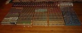
My Double Height CCC Compatible Wall Section
My Double Height CCC Compatible Wall Section
[url=http://www.bricklink.com/store.asp?p=rogue]Bricklink Store[/url] - [url=http://www.brickshelf.com/cgi-bin/gallery.cgi?m=rjcarello]Brickshelf Gallery[/url]

Re: My Double Height CCC Compatible Wall Section
I agree with you that the mottled effect of using the plates doesn't quite work - yet I applaud the attempt. That's a lot of plates!!
I like the crenelations (yes, a tad higher would be better) and the spikes are great. Very imaginative, including the HP steps as decoration.
Alan
I like the crenelations (yes, a tad higher would be better) and the spikes are great. Very imaginative, including the HP steps as decoration.
Alan
I'm a human BEING, not a human doing!
The two most important days of your life are the day you are born
and the day you discover why. (Donald Sensing)
One plus one equals three... for large values of one. (Bruce Fournier)
The two most important days of your life are the day you are born
and the day you discover why. (Donald Sensing)
One plus one equals three... for large values of one. (Bruce Fournier)
Re: My Double Height CCC Compatible Wall Section
Yeah, I'm a bit disappointed by how poorly that turned out, especially since I ordered one of the Mosiac sets for the sole purpose of using the plates in such a fashion. This wall here does not use them because I built it before the Mosiac set arrived from S@H.footsteps wrote:I agree with you that the mottled effect of using the plates doesn't quite work - yet I applaud the attempt. That's a lot of plates!!
Anyway, I do want to try making the mottled effect work. Perhaps instead of mixing the colors so much, I should try sticking to one color, maybe light grey, and then mix in a few 1x1 plates in dark grey and very light grey. Worth a shot I suppose.
Thanks, I like the crenellations too, but I am probably going to make some changes to their spacing, and I might completely replace the low parts with something a little different.I like the crenelations (yes, a tad higher would be better) and the spikes are great. Very imaginative, including the HP steps as decoration.
I don't have access to my brother's camera too often, but I'll try to post some pictures after I change the crenellations to get a feel for what people think is better.
[url=http://www.bricklink.com/store.asp?p=rogue]Bricklink Store[/url] - [url=http://www.brickshelf.com/cgi-bin/gallery.cgi?m=rjcarello]Brickshelf Gallery[/url]
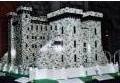
Well, it is a nice try. What I can say about the colours is: Chose one main colour, grey for instance, and make some spots of tan, and a fewer spots of dark grey. Put some brown brick or plate so here and there.
The spikes are great, if you want a special effect. Personally, I prefer a plainer crenelation. Remember, castles were originally meant for defence purposes only. And the spikes will be a more hindrance for the defenders and thus an advantage for the attackers.
But this is only a personal opinion. And I have a tendency for too much historically rightfulness, so don’t bother too much
"Too low they build, who build beneath the stars".
Edward Young / Night Thoughts.
Edward Young / Night Thoughts.
Legomaat wrote:Well, it is a nice try. What I can say about the colours is: Chose one main colour, grey for instance, and make some spots of tan, and a fewer spots of dark grey. Put some brown brick or plate so here and there.
The spikes are great, if you want a special effect. Personally, I prefer a plainer crenelation. Remember, castles were originally meant for defence purposes only. And the spikes will be a more hindrance for the defenders and thus an advantage for the attackers.
But this is only a personal opinion. And I have a tendency for too much historically rightfulness, so don’t bother too much
I thought the crenellations were pretty plain actually. Sure, the tops are tapered, but that would make it more difficult for an enemy to grab on and climb up.
Also, the spikes are probably inspired from a WarCraft game or something, but I figure they might make it more difficult for a ladder or siege engine to get right up against the wall.
Anyway, thanks for the input. I'm going to try making the colors better on the wall.
[url=http://www.bricklink.com/store.asp?p=rogue]Bricklink Store[/url] - [url=http://www.brickshelf.com/cgi-bin/gallery.cgi?m=rjcarello]Brickshelf Gallery[/url]
And, don't forget the psychological effect on the attackers. I love that point... always justifies any cool aesthetic fiddles you add to itrogue27 wrote:but I figure they might make it more difficult for a ladder or siege engine to get right up against the wall.
About the mottled effect, I'm also not applauding it, nor am i applauding it in general when it involves black, actually... I think that if you'd leave out the black (replace it with something more like grey or so), and make portions of 2 plates tall instead of one, it'll look alot better. I think now the black doesn't really mix well with the grays, and the plates are to flat and wide to look like actual stone bricks. It's more a pattern that'll work for wood i think... (hey, maybe i'll try that some time
I think Legomaat's idea of sticking to one color and mixing that sporadically with another might work pretty well, although IMO using multiple neighboring colors in equal amounts looks even better (albeit only light and dark grey). The more colors the better, as long as they don't vary too much in lightness, like between light and dark grey.
Whatever you do, don't.
-
JPinoy
- Knight Bannerett
- Posts: 2476
- Joined: Sun Nov 16, 2003 7:04 pm
- Location: Rockefeller Center LEGO Store
- Contact:
The wall feels like the Black Gate from LOTR....
Peoples_General, master of the vast LEGO armies!
[url]http://www.bricklink.com/aboutMe.asp?u=Peoples_General[/url]
Behold! The mighty armies of my ORIGIN theme!
[url]http://www.brickshelf.com/cgi-bin/gallery.c ... lesGeneral[/url]
[url]http://www.bricklink.com/aboutMe.asp?u=Peoples_General[/url]
Behold! The mighty armies of my ORIGIN theme!
[url]http://www.brickshelf.com/cgi-bin/gallery.c ... lesGeneral[/url]
-
Sir Terrance
- Councilor
- Posts: 1149
- Joined: Sun Feb 01, 2004 2:07 am
- Location: Alberta, Canada
- Contact:
I like the tails, but not too sure about the stair pieces. As for the motted effect, maybe try to keep no more that 2 or 3 of the same color pieces touching. That way it will give a more random effect. It still looks really cool, kind of like marble, but if you don't like it, try my idea if you want. 
Check out my Brickshelf gallery here:
http://www.brickshelf.com/cgi-bin/gallery.cgi?m=thebrickbin
http://www.brickshelf.com/cgi-bin/gallery.cgi?m=thebrickbin

Don't feel too bad. Achieving a random configuration of colors that looks good is very difficult. However, my brother added a feature to my website that may help when creating this pattern of building. It will work best for the 1x1 plates from the mosaic sets, but it could be used for other plates or bricks as well. Here is the link to it:
http://chosenones.dyndns.org/david/colors.php
Simply type in the name of each color you want and the total number of layers or rows you want, and click "Submit Query". The results display at the bottom of the screen.
The wall section is rather neat. It is always good to see new ideas. I don't know if such appendages were ever attached directly to the top of the walls, but I do know that stakes, spikes, and other sharp, fixed objects were occasionally used at ground level. (Pikes were the mobile variety.) I'm not sure about the handholds, but I know what you were trying to do and it is not too bad. One possibility could be to allow for some kind of exit from the wall section at the level of the lowest one onto a platform.
-
Mr. Shiny & New

- Peasant
- Posts: 71
- Joined: Mon Apr 19, 2004 7:31 pm
- Location: Canada
I like the spikes but wouldn't it be more defendable if the spikes pointed down? Otherwise you could throw a hook up onto the spike and climb up. In the town where I used to live there was an 1800s era fort that had a hill around it, and wooden poles sticking out of the hill sideways (they were sharpened). The idea was that soldiers would find it hard to climb up the hill because of the poles. However, a well placed ladder or ramp would solve that problem.
Ideally, the spikes would stick straight out. Unfortunately, the part is curved, and I had to decide between up or down. I'll try it with them pointing down and see how I like it.Mr. Shiny & New wrote:I like the spikes but wouldn't it be more defendable if the spikes pointed down? Otherwise you could throw a hook up onto the spike and climb up. In the town where I used to live there was an 1800s era fort that had a hill around it, and wooden poles sticking out of the hill sideways (they were sharpened). The idea was that soldiers would find it hard to climb up the hill because of the poles. However, a well placed ladder or ramp would solve that problem.
Thanks for the suggestion.
[url=http://www.bricklink.com/store.asp?p=rogue]Bricklink Store[/url] - [url=http://www.brickshelf.com/cgi-bin/gallery.cgi?m=rjcarello]Brickshelf Gallery[/url]
spikes
Or you could alternate themrogue27 wrote:Ideally, the spikes would stick straight out. Unfortunately, the part is curved, and I had to decide between up or down. I'll try it with them pointing down and see how I like it.
Thanks for the suggestion.

I've always liked the way you did the front of your wall. I just think the three colors all together are too much. Why not try 3/4 light gray with some dark gray scattered throughout?
http://www.brickshelf.com/cgi-bin/gallery.cgi?f=87410
Also, you could use 1 x2's with ridges on them, just to give the wall some texture. Otherwise I really like the spikes and overall design!
http://www.brickshelf.com/cgi-bin/gallery.cgi?f=87410
Also, you could use 1 x2's with ridges on them, just to give the wall some texture. Otherwise I really like the spikes and overall design!
" Black Falcon High football team rules!"