Hey all,
Back from my self-imposed exile. During the CCC I try not to comment on any entries to avoid any appearance of favoritism, but it kills me to keep silent. So at times in the past I have done general 'contest thoughts' threads: CCC II, CCC II vig category, CCC III, CCC IV, LEGO Castle Contest, CCC V, CCC VIII, to point out my praises and generally make all of the comments I would have made when individual MOCs were presented the first time. Those take a great deal of time, though, and so last year I turned to a different format, a 'MOC critiques' format. Tony did this for CCCV and CCC VI, and I did it for CCC X. Rather than simply praise the good, the idea here is to offer more constructive criticism and point out areas for improvement, upon request. Some ground rules:
1. I will only offer feedback to those who ask for it. Post your request in this thread.
2. Please only request one entry feedback per week, rather than just ask for feedback on everything. This is so I don't get completely swamped.
3. Please provide a link to your entry in your request.
4. If you ask for a critique, you have to be prepared that that critique might be negative. I want to try to highlight how a MOC could be improved, rather than just praise the good things.
5. Just a note - in some categories there were a lot of very high quality entries. So it's possible there's nothing particularly wrong with your entry, it might just be that another one was a little bit better (especially with multiple judges scoring, one judge might put entry A on top and another put entry B on top).
Note that I'm not trying to present myself as an expert MOCer here - I doubt I'd have been able to pull of an honorable mention given the high caliber of entries this year. I'm just a guy who has judged a lot of contests over the last decade and has looked at thousands of MOCs
Thanks,
Bruce
CCC XI MOC critiques thread
-
Bruce N H

- Precentor of the Scriptorium
- Posts: 6311
- Joined: Mon Sep 15, 2003 9:11 pm
- Location: Middle Zealand
- Contact:
CCC XI MOC critiques thread
[url=http://comicbricks.blogspot.com/]ComicBricks[/url] [url=http://godbricks.blogspot.com/]GodBricks[/url] [url=http://microbricks.blogspot.com/]MicroBricks[/url] [url=http://minilandbricks.blogspot.com/]MinilandBricks[/url] [url=http://scibricks.blogspot.com/]SciBricks[/url] [url=http://vignettebricks.blogspot.com/]VignetteBricks[/url] [url=http://www.classic-castle.com/bricktales/]Brick Tales[/url]
-
Purple Wolf
- Hero

- Posts: 429
- Joined: Sun Sep 25, 2011 7:53 pm
- Location: Wouldn't you like to know
Re: CCC XI MOC critiques thread
Okay I was wondering what you thought about this creation and how I could of improved it?
More pictures Here
Thanks
Purple Wolf
More pictures Here
Thanks
Purple Wolf
There's always room for dessert.
brickshelf
"Trolls exist! They steal your socks but only the left ones whats with that?"
brickshelf
"Trolls exist! They steal your socks but only the left ones whats with that?"
-
soccerkid6

- Admin

- Posts: 2169
- Joined: Fri Jun 03, 2011 6:41 pm
- Location: Nordheim Keep
- Contact:
Re: CCC XI MOC critiques thread
So excited to see that you're doing this again. I almost enjoy it more than the CCC itself
I'd like to receive some criticism of my Medieval Town entry:
 Link: http://brickbuilt.org/Daydelon-Town.php
I'd like to receive some criticism of my Medieval Town entry:
Link: http://brickbuilt.org/Daydelon-Town.phpJohn 14:6, Jesus answered, "I am the way the truth and the life. No one comes to the Father except through me."
Brickbuilt: http://www.brickbuilt.org/
Flickr: https://www.flickr.com/photos/isaacsnyder/
Brickbuilt: http://www.brickbuilt.org/
Flickr: https://www.flickr.com/photos/isaacsnyder/
-
Lord Mercat
- Laborer
- Posts: 116
- Joined: Mon Dec 31, 2012 8:23 am
Re: CCC XI MOC critiques thread
While I know this entry did very well, I would still like to receive some criticism to see where perhaps I could have improved on my "The Wanderer" figure for the Fantasy Figure category.
http://www.flickr.com/photos/33940525@N ... 246022673/
http://www.flickr.com/photos/33940525@N ... 246022673/
-
Brickninja
- Here there be dragons
- Posts: 976
- Joined: Mon Nov 04, 2013 9:41 pm
- Location: Roawia!
- Contact:
Re: CCC XI MOC critiques thread
I would like criticism on any of my entries. I know I am not a very good builder, but constructive criticism is one of the ways to get better. So any of my entries would be great to have comments on. Here are the sets for my entries on Flickr.
http://www.flickr.com/photos/110008680@ ... 148697406/
http://www.flickr.com/photos/110008680@ ... 244948623/
http://www.flickr.com/photos/110008680@ ... 602350846/
http://www.flickr.com/photos/110008680@ ... 316484713/
http://www.flickr.com/photos/110008680@ ... 316417403/
Thanks for doing this !
http://www.flickr.com/photos/110008680@ ... 148697406/
http://www.flickr.com/photos/110008680@ ... 244948623/
http://www.flickr.com/photos/110008680@ ... 602350846/
http://www.flickr.com/photos/110008680@ ... 316484713/
http://www.flickr.com/photos/110008680@ ... 316417403/
Thanks for doing this !
Romans 8:38-39
[url=http://thebricktavern.blogspot.co.uk/]The Brick Tavern[/url] [url=http://www.flickr.com/photos/110008680@N03/]Flickr[/url]
[img]http://www.brickshelf.com/gallery/lord-of-o ... tizen4.jpg[/img]
[img]http://www.brickshelf.com/gallery/t-est/LCC ... eroes2.jpg[/img]
[url=http://thebricktavern.blogspot.co.uk/]The Brick Tavern[/url] [url=http://www.flickr.com/photos/110008680@N03/]Flickr[/url]
[img]http://www.brickshelf.com/gallery/lord-of-o ... tizen4.jpg[/img]
[img]http://www.brickshelf.com/gallery/t-est/LCC ... eroes2.jpg[/img]

Re: CCC XI MOC critiques thread
Why wasn't this one good enough to be in the top five (or was it number six  ?) ?
?) ?

Here is another photo.
Here is another photo.
[url=http://www.flickr.com/photos/98280612@N05/?details=1#]Flickr[/url]
Let [them] see your good works, and glorify your father which is in heaven.
Matthew 5:16
Let [them] see your good works, and glorify your father which is in heaven.
Matthew 5:16

Re: CCC XI MOC critiques thread
Glad you doing this again Bruce, I love receiving critique! I would love some critique on my Court Entertainment Category:
CCCXI - The Unhappy Prince by mpoh98, on Flickr
CCCXI - The Unhappy Prince by mpoh98, on Flickr
[url=http://www.mocpages.com/home.php/75100]Mocpages[/url], [url=http://www.flickr.com/photos/92459453@N08/]Flickr[/url]
Support [url=https://ideas.lego.com/projects/74333]Huckleberry Finn[/url] on Lego Ideas!
Philippians 4:13
Support [url=https://ideas.lego.com/projects/74333]Huckleberry Finn[/url] on Lego Ideas!
Philippians 4:13

Re: CCC XI MOC critiques thread
Bruce,
Thanks for doing this again! Can I get feedback on my Court Entertainment entry?

http://www.flickr.com/photos/mrcp6d/set ... 486058705/
Thanks for doing this again! Can I get feedback on my Court Entertainment entry?
http://www.flickr.com/photos/mrcp6d/set ... 486058705/
Re: CCC XI MOC critiques thread
Bruce This week I would Like to get some opinions on this MOC:
http://smg.photobucket.com/user/curtw_9 ... sort=3&o=1

It is one of my first MOCS in many years, an I would love your opinions on what was working what didn't work and how to improve it.
http://smg.photobucket.com/user/curtw_9 ... sort=3&o=1
It is one of my first MOCS in many years, an I would love your opinions on what was working what didn't work and how to improve it.
So Many Hobbies So Little Time....
Come Visit me on Facebook @ Atavistic Creations
Come Visit me on Facebook @ Atavistic Creations
-
AK_Brickster

- Admin
- Posts: 3476
- Joined: Wed Jun 22, 2011 5:02 pm
- Location: Mushing through the Great Driftplains of Garheim
- Contact:
Re: CCC XI MOC critiques thread
I'm not sure if the Honorable Mentions are in any order, but here is my only "real" entry into the contest this year, other than fig-focused entries.
I'd love some feedback on it.
CCCXI - A Child's Life by AK_Brickster, on Flickr
I'd love some feedback on it.
CCCXI - A Child's Life by AK_Brickster, on Flickr


Re: CCC XI MOC critiques thread
Thanks for doing this again. I like reading all your comments to all the builds, not just my own critique.
Anyway, I would love to get some comments on this build:
Here is the flickr set with all 3 images: http://www.flickr.com/photos/bentoft/se ... 558094534/
Anyway, I would love to get some comments on this build:
Here is the flickr set with all 3 images: http://www.flickr.com/photos/bentoft/se ... 558094534/
[img]http://www.brickshelf.com/gallery/lord-of-o ... tizen3.jpg[/img] [img]http://farm9.staticflickr.com/8244/84879601 ... 04d4_t.jpg[/img] [url=http://www.flickr.com/photos/bentoft/][img]http://www.worldwatch.org/system/files/images/e2/Flickr.jpg[/img][/url]
-
Bruce N H
- Precentor of the Scriptorium
- Posts: 6311
- Joined: Mon Sep 15, 2003 9:11 pm
- Location: Middle Zealand
- Contact:
Re: CCC XI MOC critiques thread
Hey guys,
Purple Wolf Right under their noses
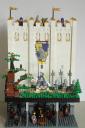
I really like the big wall. I know I'm the guy who coined the phrase 'big gray wall syndrome' (big white wall here), but I think that some people go way too far the opposite direction, greebling the heck out of their walls. Here you've done a nice job - I particularly like that little detail with those (I think) joint pieces inset into arches near the top, and that large purple wolf banner. My only complaint with the wall is the line of three windows - I think those are unrealistically too close to the ground for a defensive wall. The little trap door entrance in the tree is a fun play feature and kind of reminded me of Hogan's Heroes, but I disliked the tree itself. It starts out 6-wide at the bottom but quickly gets really spindly. If you have a tree that wide at the base, it realistically would be much bigger, and have a lot more leaf pieces. One simple thing is that 1x5x4 arch pointing off to the right would look better if there were brown cheese wedges on those two studs. Okay, this brings us to the actual hideout. A general complaint I have with underground rooms, and you have this problem here, is that people make the ground above them way too thin. There's a road running right above this underground chamber. Unless the ceiling is made of reinforced steel girders, that horse is going to come crashing through right into Vladek's planning session. Also, underground hideouts probably shouldn't be so wide-open and flat-floored. This would be improved if that part was cramped and had an irregular floor.
Soccerkid6 Town of Daydelon
This is a really lovely MOC and there's nothing I would say was really wrong with it. It's just that this was a very strong category this year, and several others had something special that set them a little higher. I do think that yours was hurt by presentation in the photos you chose - I like it better now that I'm going through the full range of pictures. If I were you I would have chosen the overview photo I've linked above, but then for my other two shots I would have gone with one of those ground-level photos you have, like the 9th or 10th one on your site, because those bring you down into the MOC and highlight some of the build details that get hidden in the broader shots. Then for the third shot I would have picked one of the furnished room close-ups - I know you have that birds-eye-view with the roofs off to show that the interiors are complete, but there you can't actually see the details of the furnishings well.
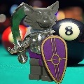
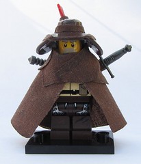
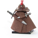
Lord Mercat the Wanderer
As you note, this did well and was an honorable mention, and also you won that category with your other entry (which was better, IMO, and used more customizing technique). My favorite bit of this is the layered overlapping capes at the back. I thought that just gave that part a really nice look. My least favorite was the strips of cloth on the hat. I assume that those were to cover up where you chopped up the hat element to get that shape, but IMO those parts look sloppy. I wonder if it would be possible to get that hat shape by partially melting and reshaping the existing hat, or maybe by taking your cut-up reshaped hat and use it as the first step in doing a resin cast to make a new hat piece. One complaint I had about this fig was that it didn't really say 'fantasy' fig to me. You could have entered this in 'realistic' and I wouldn't have batted an eye. Actually, the fig doesn't even really say 'castle' to me - you could give this guy a sawed-off shotgun and put him in a post-apoc MOC and he'd fit right in. Anyway, all that said, a nice fig and I scored him well, just not as well as your other fig.
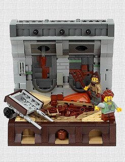
Brickninja - did you see the part in the first post where I said "Please only request one entry feedback per week, rather than just ask for feedback on everything."? I'll go with your first MOC. Come back next week and ask about another that you'd like feedback on. Rogues' Gathering
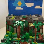
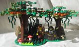
I'll start with what I really liked - that sky backdrop is a nice touch, though perhaps mixing in some white plates would give your clouds a less blocky shape. Inside the cave the scroll on the table is very nice, and I also like the weapons and other supplies. My main complaint on the inside is the same as with Purple Wolf above - it's supposed to be a cave, but it looks more like a room in a castle, with straight vertical walls (yes, with a couple of gaps to make them look a little more rugged), and a perfectly flat tiled floor. Then above the cave there is one layer of bricks, so there's no way this cave doesn't collapse in on the people inside. On the outside, I think the color scheme could use some work. Mottling, both in the greenery and in the stone, seems to work better (IMO) when there is one major color with little accents here and there of other colors. Also, your three trees are all the same height as each other, and all the same height as the little cliff, and that really flattens out the scene. It would be improved if you put one of the trees on top, or even part-way up the cliff, and have the two trees on the lower level at different heights (one taller than the cliff and one shorter).
Josdu Drastic end

It was just hard to really get a handle on this one. I think your entry would have been improved if, instead of trying to show flying, crashing, crashed, you had instead just focused on the first 'flying' picture, and used the scared looks on the faces and perhaps the angle of the flying machine to show that they're going down. Also, a separate shot of just the flying machine would have been nice, as it is hard to see how it works. Be careful with fig placement - I have no idea what that fourth fig, the one with the knife, is doing. He seems to be clueless about the contraption about to crash into him.
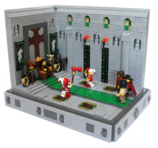
Matthew Unhappy Prince.
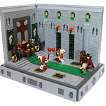
This was another really strong category this year. A lot of the entries were very similar in that they had a throne room with someone standing in front of the king doing something. So for all of those which were in that general scheme, I really judged them twice - once on the throne room and again on the 'action'. Here I really liked the throne room a lot. You did a lot with the interplay between textured parts and smooth, the little inset statues and the green/tan checkerboard pattern in those arches, the carpet running down the floor. I wasn't as big a fan of the cheese wedge mosaics in the floor - maybe if instead of the gold you had a few more dark green to make those into star patterns and then surround the rest with light gray. I really like the 'faction' you put together by your choice of torsos and the Rohan banners (except, as one Flickr commenter noted, that armor on the guy next to the throne). In fact, I thought that with very little tweaking this could have been a good entry for the 'custom faction' category. In this it was the action that left me a little flat. I get the story in your description (though actually writing a whole story would have been nicer than saying 'I remember a story that vaguely included these parts'), but I don't judge on the description but on the build, and the jesters here fall a little flat compared to the 'action' in some of the other scenes. Compare, for instance, to Brother Stevens, which is very similar to yours in the overall layout (and I liked your throne room a tiny bit better than his), his jester acrobatics seem more interesting and alive than your two.
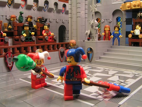
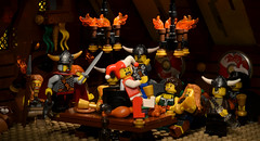
Mrcp6d Clowns and Vikings
This had some nice details like the ceiling and the torch-holder, and the action is extremely well done. My suggestion here is just some editing. I would have removed some of the details behind the figs to better contrast the fig action with a plainer background - specifically I would have gotten rid of those apples, the crate of fish, the green and yellow flags, and that unicorn horn. Then I would have put a little more debris on the floor in front of the table - a couple of bottles and goblets, maybe a chicken leg (these are Vikings, after all). Also, one well-lit photo from a low angle would be nice - I think that the interior of that room is really well made, with those tiles on the walls and the ceiling details, but it's hard to appreciate in the photos you included.
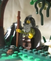
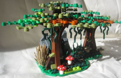
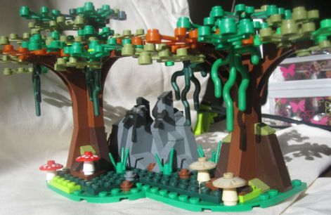
Lil-Curt Walk in the wood
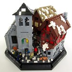
This is a nice little MOC. It's main problem is that it was in the misc category, where a 'nice little MOC' can never win. The dirty little secret of the misc category is that there are people who have been working in private on major works for months, and when the CCC is announced, if the thing they are working on doesn't fit a category, it goes in misc. For exhibit A, FanLego posted this Lindon Castle on the day the CCC was announced (remember, you can work on entries before hand, the rule is against any entry that was displayed in public or online before the start of the CCC). So the misc win pretty much always goes to something big and amazing.
All of that said, let's critique this actual MOC. I thought the vegetation and landscaping was really nice. I would lose the lime green plates as accents - I think the color contrast with the green/dark green ground is too jarring. Adding some dark green 1x2 or 1x1 plates to break up the long straight-edge of the dark green plate would be nice. Also in the tree-tops I would probably lose the three orange leaf pieces. Again, I just think the color contrast with the green/olive green leaves is too much (OTOH, a house down the street from me has a bush that is half-dead, and so it has this all dark green little leaves, and then there's this portion that is almost a third of the bush that is just this orangish dried-out dead color, so I certainly see precedent for this sort of color contrast in nature). The 'action' here is lackluster - the two figs are pretty much standing. I think this would be better if you had them doing something more active - maybe put a deer in the scene and have them hunting.
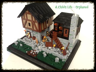
AK_Brickster Orphaned

I really loved this entry, and as you ascertained it scored very highly. The town is well made (and could have been in the medieval town category as well) and has some great build details (vertical window on the right-hand building, roof on the left-hand building, the rough stone walls, etc). Fig posing is perfect for all five characters - this is what I've talked about so often in the past. Even if I didn't have the background in your description, here I can see that each character has a story, and they are each living out those stories, rather than just being randomly placed around as people so often do. I love the muted color scheme overall - it perfectly fits the mood of the piece, which would have been hurt if some of the figs were walking around in bright colors. I maybe would have put one drop of color in the scene as a focal point - put a red single flower on one of the graves. I know it wouldn't be all that realistic for these poor orphans to be getting flowers when they're struggling to just survive, but I could imagine the girl finding a wildflower when she was out scrambling for a few roots or a rotten apple to eat, and saving it and carrying it back to put on her mother's grave. Just a thought. My other, very minor, suggestions would be to make the road more primarily dark gray, to better offset the light gray walls of the homes and the light gray wall to the cemetery. Oh, and maybe the ground of the cemetery would have been better in olive green rather than dark green, but that's a judgement call. Oh, btw, best detail is the crumbled down statue at the entrance to the cemetery.
Bentoft Royal jester and his son

This was another really strong entry in a really strong category, so I can't say it has any failings. I particularly liked how this felt very much like it was part of a very large castle, with that pillar and arches holding up the unseen ceiling, that gallery up above, and an archway in the back corner leading to another part of the castle. There is a hint of some interesting politics here, with the three nobles with their own chairs secondary to the main king's throne. One suggestion would be that instead of having two overview shots (from different angles) and one figs-eye-view photo, to instead have one overview shot, the close-up of the jester and the another figs-eye view from the perspective of the king, or someone in that gallery on the left. My only real critique of this entry was the same as I said on Matthew's above - I thought the actual physical location of the throne room was outstanding, I just thought that some of the others had a little more interest in the action of the figs.
Anyway, that's my first round of thoughts. I hope those critiques made sense.
Bruce
Purple Wolf Right under their noses
I really like the big wall. I know I'm the guy who coined the phrase 'big gray wall syndrome' (big white wall here), but I think that some people go way too far the opposite direction, greebling the heck out of their walls. Here you've done a nice job - I particularly like that little detail with those (I think) joint pieces inset into arches near the top, and that large purple wolf banner. My only complaint with the wall is the line of three windows - I think those are unrealistically too close to the ground for a defensive wall. The little trap door entrance in the tree is a fun play feature and kind of reminded me of Hogan's Heroes, but I disliked the tree itself. It starts out 6-wide at the bottom but quickly gets really spindly. If you have a tree that wide at the base, it realistically would be much bigger, and have a lot more leaf pieces. One simple thing is that 1x5x4 arch pointing off to the right would look better if there were brown cheese wedges on those two studs. Okay, this brings us to the actual hideout. A general complaint I have with underground rooms, and you have this problem here, is that people make the ground above them way too thin. There's a road running right above this underground chamber. Unless the ceiling is made of reinforced steel girders, that horse is going to come crashing through right into Vladek's planning session. Also, underground hideouts probably shouldn't be so wide-open and flat-floored. This would be improved if that part was cramped and had an irregular floor.
Soccerkid6 Town of Daydelon
This is a really lovely MOC and there's nothing I would say was really wrong with it. It's just that this was a very strong category this year, and several others had something special that set them a little higher. I do think that yours was hurt by presentation in the photos you chose - I like it better now that I'm going through the full range of pictures. If I were you I would have chosen the overview photo I've linked above, but then for my other two shots I would have gone with one of those ground-level photos you have, like the 9th or 10th one on your site, because those bring you down into the MOC and highlight some of the build details that get hidden in the broader shots. Then for the third shot I would have picked one of the furnished room close-ups - I know you have that birds-eye-view with the roofs off to show that the interiors are complete, but there you can't actually see the details of the furnishings well.
Lord Mercat the Wanderer
As you note, this did well and was an honorable mention, and also you won that category with your other entry (which was better, IMO, and used more customizing technique). My favorite bit of this is the layered overlapping capes at the back. I thought that just gave that part a really nice look. My least favorite was the strips of cloth on the hat. I assume that those were to cover up where you chopped up the hat element to get that shape, but IMO those parts look sloppy. I wonder if it would be possible to get that hat shape by partially melting and reshaping the existing hat, or maybe by taking your cut-up reshaped hat and use it as the first step in doing a resin cast to make a new hat piece. One complaint I had about this fig was that it didn't really say 'fantasy' fig to me. You could have entered this in 'realistic' and I wouldn't have batted an eye. Actually, the fig doesn't even really say 'castle' to me - you could give this guy a sawed-off shotgun and put him in a post-apoc MOC and he'd fit right in. Anyway, all that said, a nice fig and I scored him well, just not as well as your other fig.
Brickninja - did you see the part in the first post where I said "Please only request one entry feedback per week, rather than just ask for feedback on everything."? I'll go with your first MOC. Come back next week and ask about another that you'd like feedback on. Rogues' Gathering
I'll start with what I really liked - that sky backdrop is a nice touch, though perhaps mixing in some white plates would give your clouds a less blocky shape. Inside the cave the scroll on the table is very nice, and I also like the weapons and other supplies. My main complaint on the inside is the same as with Purple Wolf above - it's supposed to be a cave, but it looks more like a room in a castle, with straight vertical walls (yes, with a couple of gaps to make them look a little more rugged), and a perfectly flat tiled floor. Then above the cave there is one layer of bricks, so there's no way this cave doesn't collapse in on the people inside. On the outside, I think the color scheme could use some work. Mottling, both in the greenery and in the stone, seems to work better (IMO) when there is one major color with little accents here and there of other colors. Also, your three trees are all the same height as each other, and all the same height as the little cliff, and that really flattens out the scene. It would be improved if you put one of the trees on top, or even part-way up the cliff, and have the two trees on the lower level at different heights (one taller than the cliff and one shorter).
Josdu Drastic end
It was just hard to really get a handle on this one. I think your entry would have been improved if, instead of trying to show flying, crashing, crashed, you had instead just focused on the first 'flying' picture, and used the scared looks on the faces and perhaps the angle of the flying machine to show that they're going down. Also, a separate shot of just the flying machine would have been nice, as it is hard to see how it works. Be careful with fig placement - I have no idea what that fourth fig, the one with the knife, is doing. He seems to be clueless about the contraption about to crash into him.
Matthew Unhappy Prince.
This was another really strong category this year. A lot of the entries were very similar in that they had a throne room with someone standing in front of the king doing something. So for all of those which were in that general scheme, I really judged them twice - once on the throne room and again on the 'action'. Here I really liked the throne room a lot. You did a lot with the interplay between textured parts and smooth, the little inset statues and the green/tan checkerboard pattern in those arches, the carpet running down the floor. I wasn't as big a fan of the cheese wedge mosaics in the floor - maybe if instead of the gold you had a few more dark green to make those into star patterns and then surround the rest with light gray. I really like the 'faction' you put together by your choice of torsos and the Rohan banners (except, as one Flickr commenter noted, that armor on the guy next to the throne). In fact, I thought that with very little tweaking this could have been a good entry for the 'custom faction' category. In this it was the action that left me a little flat. I get the story in your description (though actually writing a whole story would have been nicer than saying 'I remember a story that vaguely included these parts'), but I don't judge on the description but on the build, and the jesters here fall a little flat compared to the 'action' in some of the other scenes. Compare, for instance, to Brother Stevens, which is very similar to yours in the overall layout (and I liked your throne room a tiny bit better than his), his jester acrobatics seem more interesting and alive than your two.
Mrcp6d Clowns and Vikings
This had some nice details like the ceiling and the torch-holder, and the action is extremely well done. My suggestion here is just some editing. I would have removed some of the details behind the figs to better contrast the fig action with a plainer background - specifically I would have gotten rid of those apples, the crate of fish, the green and yellow flags, and that unicorn horn. Then I would have put a little more debris on the floor in front of the table - a couple of bottles and goblets, maybe a chicken leg (these are Vikings, after all). Also, one well-lit photo from a low angle would be nice - I think that the interior of that room is really well made, with those tiles on the walls and the ceiling details, but it's hard to appreciate in the photos you included.
Lil-Curt Walk in the wood
This is a nice little MOC. It's main problem is that it was in the misc category, where a 'nice little MOC' can never win. The dirty little secret of the misc category is that there are people who have been working in private on major works for months, and when the CCC is announced, if the thing they are working on doesn't fit a category, it goes in misc. For exhibit A, FanLego posted this Lindon Castle on the day the CCC was announced (remember, you can work on entries before hand, the rule is against any entry that was displayed in public or online before the start of the CCC). So the misc win pretty much always goes to something big and amazing.
All of that said, let's critique this actual MOC. I thought the vegetation and landscaping was really nice. I would lose the lime green plates as accents - I think the color contrast with the green/dark green ground is too jarring. Adding some dark green 1x2 or 1x1 plates to break up the long straight-edge of the dark green plate would be nice. Also in the tree-tops I would probably lose the three orange leaf pieces. Again, I just think the color contrast with the green/olive green leaves is too much (OTOH, a house down the street from me has a bush that is half-dead, and so it has this all dark green little leaves, and then there's this portion that is almost a third of the bush that is just this orangish dried-out dead color, so I certainly see precedent for this sort of color contrast in nature). The 'action' here is lackluster - the two figs are pretty much standing. I think this would be better if you had them doing something more active - maybe put a deer in the scene and have them hunting.
AK_Brickster Orphaned
I really loved this entry, and as you ascertained it scored very highly. The town is well made (and could have been in the medieval town category as well) and has some great build details (vertical window on the right-hand building, roof on the left-hand building, the rough stone walls, etc). Fig posing is perfect for all five characters - this is what I've talked about so often in the past. Even if I didn't have the background in your description, here I can see that each character has a story, and they are each living out those stories, rather than just being randomly placed around as people so often do. I love the muted color scheme overall - it perfectly fits the mood of the piece, which would have been hurt if some of the figs were walking around in bright colors. I maybe would have put one drop of color in the scene as a focal point - put a red single flower on one of the graves. I know it wouldn't be all that realistic for these poor orphans to be getting flowers when they're struggling to just survive, but I could imagine the girl finding a wildflower when she was out scrambling for a few roots or a rotten apple to eat, and saving it and carrying it back to put on her mother's grave. Just a thought. My other, very minor, suggestions would be to make the road more primarily dark gray, to better offset the light gray walls of the homes and the light gray wall to the cemetery. Oh, and maybe the ground of the cemetery would have been better in olive green rather than dark green, but that's a judgement call. Oh, btw, best detail is the crumbled down statue at the entrance to the cemetery.
Bentoft Royal jester and his son
This was another really strong entry in a really strong category, so I can't say it has any failings. I particularly liked how this felt very much like it was part of a very large castle, with that pillar and arches holding up the unseen ceiling, that gallery up above, and an archway in the back corner leading to another part of the castle. There is a hint of some interesting politics here, with the three nobles with their own chairs secondary to the main king's throne. One suggestion would be that instead of having two overview shots (from different angles) and one figs-eye-view photo, to instead have one overview shot, the close-up of the jester and the another figs-eye view from the perspective of the king, or someone in that gallery on the left. My only real critique of this entry was the same as I said on Matthew's above - I thought the actual physical location of the throne room was outstanding, I just thought that some of the others had a little more interest in the action of the figs.
Anyway, that's my first round of thoughts. I hope those critiques made sense.
Bruce
[url=http://comicbricks.blogspot.com/]ComicBricks[/url] [url=http://godbricks.blogspot.com/]GodBricks[/url] [url=http://microbricks.blogspot.com/]MicroBricks[/url] [url=http://minilandbricks.blogspot.com/]MinilandBricks[/url] [url=http://scibricks.blogspot.com/]SciBricks[/url] [url=http://vignettebricks.blogspot.com/]VignetteBricks[/url] [url=http://www.classic-castle.com/bricktales/]Brick Tales[/url]

Re: CCC XI MOC critiques thread
Hi Bruce,
thanks for doing this again. Could you please share your thoughts with me on my child's life entry Take your child to work day?
Cheers
Adam
thanks for doing this again. Could you please share your thoughts with me on my child's life entry Take your child to work day?
Cheers
Adam
[img]http://farm4.staticflickr.com/3824/10273930866_0367c2bfc7_n.jpg[/img] [img]http://farm8.staticflickr.com/7382/10274151466_d13e631710_o.jpg[/img] [img]http://farm3.staticflickr.com/2853/11159084613_911450a967_o.gif[/img]
[url=http://www.flickr.com/photos/90979715@N05/]My Flickr photostream[/url]
[url=http://www.flickr.com/photos/90979715@N05/sets/]My Flickr sets[/url]
[url=http://www.flickr.com/photos/90979715@N05/]My Flickr photostream[/url]
[url=http://www.flickr.com/photos/90979715@N05/sets/]My Flickr sets[/url]

Re: CCC XI MOC critiques thread
I'd like some feedback on this entry please:
[img]http://farm9.staticflickr.com/8120/86369329 ... 2cc9_m.jpg[/img]
[url=https://www.flickr.com/photos/112482494@N07/]Flickr[/url] [url=http://www.mocpages.com/home.php/79686]Mocpages[/url] [url=http://www.brickshelf.com/cgi-bin/gallery.cgi?m=Jbob]Brickshelf[/url]
Whatever you do, work at it with all your heart, as working for the Lord, not for men. Colossians 3:23
[url=https://www.flickr.com/photos/112482494@N07/]Flickr[/url] [url=http://www.mocpages.com/home.php/79686]Mocpages[/url] [url=http://www.brickshelf.com/cgi-bin/gallery.cgi?m=Jbob]Brickshelf[/url]
Whatever you do, work at it with all your heart, as working for the Lord, not for men. Colossians 3:23
-
Brickninja
- Here there be dragons
- Posts: 976
- Joined: Mon Nov 04, 2013 9:41 pm
- Location: Roawia!
- Contact:
Re: CCC XI MOC critiques thread
Thanks for the critique Bruce, I think it will help! Next can you review my The Human Catapult MOC?
CCCXI "Trial and Error" The Human Catapult by Brickninja, on FlickrPlease keep in mind I have a fairly limited supply of parts at the moment, other wise the MOC would have been better.
CCCXI "Trial and Error" The Human Catapult by Brickninja, on FlickrPlease keep in mind I have a fairly limited supply of parts at the moment, other wise the MOC would have been better.
Romans 8:38-39
[url=http://thebricktavern.blogspot.co.uk/]The Brick Tavern[/url] [url=http://www.flickr.com/photos/110008680@N03/]Flickr[/url]
[img]http://www.brickshelf.com/gallery/lord-of-o ... tizen4.jpg[/img]
[img]http://www.brickshelf.com/gallery/t-est/LCC ... eroes2.jpg[/img]
[url=http://thebricktavern.blogspot.co.uk/]The Brick Tavern[/url] [url=http://www.flickr.com/photos/110008680@N03/]Flickr[/url]
[img]http://www.brickshelf.com/gallery/lord-of-o ... tizen4.jpg[/img]
[img]http://www.brickshelf.com/gallery/t-est/LCC ... eroes2.jpg[/img]