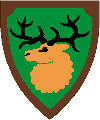
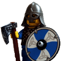
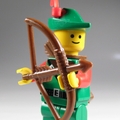
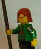
Nice custom work! The good guys and the bad guys (assuming that the blue-ys are bad and the others are good) both look great. Your pictures are pretty clear too.
You should probably change the pics to links though, since they are pretty big. Most people would need to scroll to see them.
Duke_Dave wrote:
TTK wrote:
Contrast seems poor though, are you just using regular paper?
Yes, do you think I should use photopaper?
Dave
I use photopaper because I can tell the difference, but I also go to the extra trouble now of coloring the edges (with colored pencils). It's one of those personal things - if you are happy with what you have, then stick with it. What I would recommend is that you try it as least once to see if you think it is worth it. Once you see properly saturated hues and deep blacks, I think you'll understand what you have been missing.
Redwine the Ribald: Stare long enough into the abyss...
Two-Tonic Tippler: ...and you spit into it.
Duke_Dave wrote:
TTK wrote:
Contrast seems poor though, are you just using regular paper?
Yes, do you think I should use photopaper?
Dave
I use photopaper because I can tell the difference, but I also go to the extra trouble now of coloring the edges (with colored pencils). It's one of those personal things - if you are happy with what you have, then stick with it. What I would recommend is that you try it as least once to see if you think it is worth it. Once you see properly saturated hues and deep blacks, I think you'll understand what you have been missing.
Well thanks for the sugestion. I would like to try it sometime but don't currently have any so it will have to wait for now.


