Page 1 of 1
Wizard
Posted: Sun Oct 28, 2007 4:18 am
by Lamanda2
Hello,
Looking for something to do earlier today I opened a picture of a wizard minifig of mine and decided to have some fun editing it some.
The result:
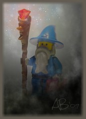 -Flickr Link-
C & C welcome.

~Amanda
Posted: Sun Oct 28, 2007 4:24 pm
by Peppermint Pig
It's a little dark on my screen. I'd probably adjust the saturation and tweak the blue... a little darker, a little more saturant. Auto levels??
Posted: Sun Oct 28, 2007 5:50 pm
by Lamanda2
"It's a little dark on my screen."
Well, it's supposed to be dark.
'Tis night after-all.

Posted: Mon Oct 29, 2007 1:18 am
by plums_deify
I think part of what's throwing the "night" perception off a bit is the fact that it sorta looks like you layered darkness right on the wizard, without darkening that layer at all.
Try darkening the wizard layer, and lightening the "fog/dark" layer just a tad. That might be what it needs.
Posted: Mon Oct 29, 2007 4:03 am
by Lamanda2
"I think part of what's throwing the "night" perception off a bit is the fact that it sorta looks like you layered darkness right on the wizard, without darkening that layer at all.
Try darkening the wizard layer, and lightening the "fog/dark" layer just a tad. That might be what it needs."
Ah, now I see what you mean.
Alright, I tried adjusting the wizard layer a bit darker and whatnot so here's how that worked out:
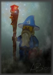 -Link to Flickr Page-
I think it looks better than the first take, what with the background now being a blue-ish tone, rather than pale grey.
Any thoughts on the second take? Did I make it better, or worse?
Thanks for the tips, the both of you.
~Amanda
Posted: Tue Oct 30, 2007 11:01 am
by ottoatm
That is cool! It looks like it should be a LEGO Magic card or something.
I love that staff, and the way you make most of the light seem to focus on it's magical gem at the end.
Neat stuff~
Posted: Sat Nov 03, 2007 4:10 pm
by Hob Took
I thought it should be the king of a deck of cards. I like how you toned down the red lighting from the first to the second picture. It still looks like the staff is the main point of light, but not overwhelmingly so.
Hob Took
Posted: Sat Nov 03, 2007 5:13 pm
by ottoatm
Hob Took wrote:I thought it should be the king of a deck of cards.
Cool idea! Although an Ace would perhaps be more fitting. LEGO cards... very neat idea~
Posted: Sat Nov 03, 2007 8:09 pm
by Quickblade22
This is cool. Did you use photoshop for this? I'm not sure what you were going for, but to me it looks like the wizard is at the top of mountain peering into a dark cave entrance with snow falling behind him. Kinda reminicent of Gandalf in the Misty Mountains.
Posted: Sun Nov 04, 2007 12:17 am
by Black Falcon
I love messing around with photoshop myself and seeing what other people come up with; this is amazing! I love the darkness, the fog/mist, and the slight glow from the staff. I agree with Quickblade22, it has a Gandalf feel to it. Misty Mountains or Mines of Moria.
Are you planning on doing more stuff like this? (I'd love to see it!)
Posted: Sun Nov 04, 2007 4:07 am
by Lamanda2
"That is cool! It looks like it should be a LEGO Magic card or something."
"I thought it should be the king of a deck of cards."
"Cool idea! Although an Ace would perhaps be more fitting. LEGO cards... very neat idea"
..That is a very neat idea. Might be a fun project to take on, creating myself a neat deck of cards.
(Would be neat to use my card faction knights for the pictures, too.)
"I like how you toned down the red lighting from the first to the second picture. It still looks like the staff is the main point of light, but not overwhelmingly so."
Thanks for the input. I was kinda dissapointed about the red being more faint now, but you're right, it was a bit overwhelming at first.
"This is cool. Did you use photoshop for this?"
I used Paint.NET, since I'm confortable using that program. Don't have photoshop actually, I'm too cheap to buy programs, which is why I use all the nice free programs out there.
"I'm not sure what you were going for, but to me it looks like the wizard is at the top of mountain peering into a dark cave entrance with snow falling behind him."
Wasn't really going for anything, just playing around to make something I liked. Suppose it could be whatever you imagine it to be (I like your description).
"Are you planning on doing more stuff like this? (I'd love to see it!)"
I havn't planned it, since this was sort of a spur of the moment thing, but I'm sure I'll be doing more editing similar to this since I love to play around with photo-editing in my spare time.
~Amanda
Posted: Sat Dec 08, 2007 2:26 am
by venvorskar
This is a really good picture, but there's just two things left I think you could improve. The stars look kind of unnatural- you could try blurring them a bit and making them different colors; and it looks more like the light is coming from a opening above him than from his staff (although maybe you want it like that).
Those are just two small things; I like it a lot, and it's as good as anything that can be made in Photoshop.
Posted: Mon Dec 10, 2007 8:40 pm
by Traveler
I might add a little more red around the staff, if the light is coming from it. It looks like the red jewel is emitting white light.
I think you should do a series of these. It would be cool to make up a card game based on them! It would probably become all the rage around here!