Page 1 of 1
Brik Battles - New Minifig Design
Posted: Sat May 01, 2004 12:10 am
by Ramus
Hola,
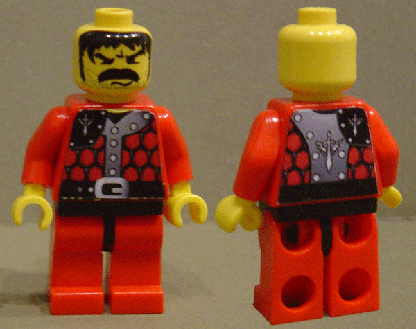
Here is a new design I have been working on for a faction in Brik Battles. Let me know what you think.
http://www.brickshelf.com/gallery/Ramus ... nnaire.gif
FRONT
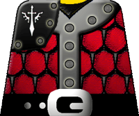 REAR
REAR
Thanks,
-- Ramus
Posted: Sat May 01, 2004 3:07 am
by Sir Terrance
Ooh, very very nice. Love it!
Posted: Sun May 02, 2004 5:30 pm
by forester3291
Cool. The detail is great. It most has a ninja mercenary look
Posted: Mon May 03, 2004 12:16 am
by The Blue Knight
Very nice. I should look into Brik Battles
Posted: Wed May 05, 2004 6:29 am
by Ramus
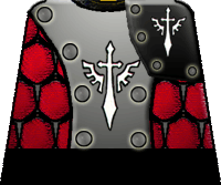
Here is another update for the Brik Battles graphics.
Full Figure:
http://www.brickshelf.com/cgi-bin/gallery.cgi?i=748120
Front Torso:
 Rear Torso:
Again, let me know what you think.
Thanks,
-- Ramus
www.brikbattles.com
Posted: Wed May 05, 2004 3:07 pm
by TwoTonic Knight
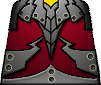
Beautifully done. Some suggestions: I think the assymetrical black shoulder guard conflicts a bit with the vertical gray bands that also go to the shoulders. It's almost a case of I'd do one or the other, but not both. The winged sword design is very attractive, so what I would probably do is remove the shoulder piece and use the back gray strap on the front also.
An alternative would be to remove the gray straps (for want of a better word) entirely and use two shoulder guards. That would give you a second torso clearly from the same faction, but I slightly different look. But the same kind of thing could be achieved by varying the actual torso color of the fig, or the arms. I can see gray, black and red combinations for those all working.
Posted: Wed May 05, 2004 3:40 pm
by Loneranger
looks pretty good =P
Posted: Thu May 06, 2004 12:02 am
by Glencaer
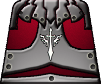
That sword design is tizzight! Is it of your design? It seems very familiar to me.
Nice torso designs, they all look very good!
-Lenny
Posted: Thu May 06, 2004 11:24 pm
by Ramus
That sword design is tizzight! Is it of your design? It seems very familiar to me.
Naa... unfortuanatly not...
The design is from an old Warhammer40K graphic. Never played the game, but love their artwork.
Beautifully done. Some suggestions: I think the assymetrical black shoulder guard conflicts a bit with the vertical gray bands that also go to the shoulders. It's almost a case of I'd do one or the other, but not both. The winged sword design is very attractive, so what I would probably do is remove the shoulder piece and use the back gray strap on the front also.
An alternative would be to remove the gray straps (for want of a better word) entirely and use two shoulder guards. That would give you a second torso clearly from the same faction, but I slightly different look. But the same kind of thing could be achieved by varying the actual torso color of the fig, or the arms. I can see gray, black and red combinations for those all working.
I am still in the process of finalizing some of the designs. Once I get the main designs for the faction roughed, I will tweak them. I agree on the pauldron. Thanks.
Thanks for all the comments & suggestions. I am working on a few new ones & will keep you updated.
-- Ramus
Posted: Sun May 16, 2004 1:45 pm
by legodude101
You got that sword sign from Warhammer 40k. Nice armour.
Posted: Mon May 17, 2004 8:01 pm
by Formendacil
I like the torso designs: they look cool and very official. And they are sights beyond what KK2 is coming out with.

Posted: Mon May 17, 2004 9:18 pm
by Rubberchickenknight
cool

looks oriental you could make a cool shogun using that torso design
