Update Regarding KK2 Stuff
Posted: Sun Jun 20, 2004 2:32 am
As I finished the five octagonal shield designs (on to customs!), I discovered that the accent color on Santis (or whever the red, bear knight's name is) is not dark grey as I first believed, but rather sand blue. The picture I worked off of to created the armor design on a torso sticker was a little dark, and so I dismissed the sand blue for the new blueish-dark grey.
Subsequently, I have updated all 'red' versions of the armor torsos in the Appendix article to reflect the sand blue color change, though I neglected (cause I'm lazy) to update the thumbnails.
I realize that this won't matter to most of you, but I felt I needed to correct my error.
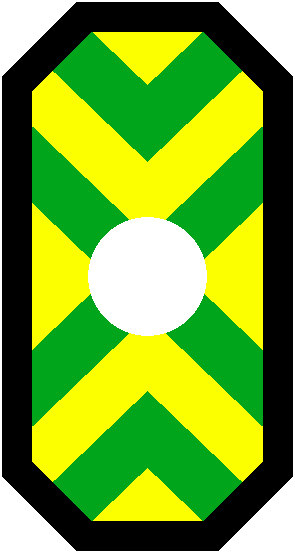
On a side note: Now that I have completed re-creating the five shield designs for the new KK2 minifigs, I must say that I'm rather disappointed in their designs. Both the large and minifig shield designs are, for the most part, very angular, geometric, and in my opinion rather uninspired.
Granted, I really like the Scorpion and Wolf designs, these should have been brought out with Fright Knights and Wolfpack, respectively, IMO.
But all five designs, being so angular, the minfig versions in particular, look 'thrown together' to me, like LEGO ran out of time, or perhaps made minifig versions of the knights if (when) they realized the big knights wouldn't sell well alone. Or maybe LEGO didn't have designs for any of them till the eleventh hour.
In any case, I'm sure the real story is simply the designer was feeling slick and created the designs using almost all straight lines, giving a very stylized look to them. But to me, after doing LEGO's other factions, these were rather disappointing to recreate. I just did Vladek's minifig shield in less than thirty minutes. I guess I was just hoping for more of a challenge.
But as I said at the beginning of my rant... err.. post... On to the customs!
--Anthony
Subsequently, I have updated all 'red' versions of the armor torsos in the Appendix article to reflect the sand blue color change, though I neglected (cause I'm lazy) to update the thumbnails.
I realize that this won't matter to most of you, but I felt I needed to correct my error.
On a side note: Now that I have completed re-creating the five shield designs for the new KK2 minifigs, I must say that I'm rather disappointed in their designs. Both the large and minifig shield designs are, for the most part, very angular, geometric, and in my opinion rather uninspired.
Granted, I really like the Scorpion and Wolf designs, these should have been brought out with Fright Knights and Wolfpack, respectively, IMO.
But all five designs, being so angular, the minfig versions in particular, look 'thrown together' to me, like LEGO ran out of time, or perhaps made minifig versions of the knights if (when) they realized the big knights wouldn't sell well alone. Or maybe LEGO didn't have designs for any of them till the eleventh hour.
In any case, I'm sure the real story is simply the designer was feeling slick and created the designs using almost all straight lines, giving a very stylized look to them. But to me, after doing LEGO's other factions, these were rather disappointing to recreate. I just did Vladek's minifig shield in less than thirty minutes. I guess I was just hoping for more of a challenge.
But as I said at the beginning of my rant... err.. post... On to the customs!
--Anthony