Page 1 of 1
I need your opinion
Posted: Fri Jan 16, 2004 5:14 pm
by SavaTheAggie
Only two more torsos to re-create and I'll be on my way to finishing my Torso Sticker Article Volume 2, yay! Of course I also have to work on color variations, but that isn't nearly as hard as creating new torsos.
And so on the note of hard torsos, I submit this:
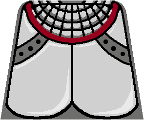
This Knight's Kingdom torso is rather common now, or was, but since I created it's compliment from the KK line I decided to go for it. Unfortunately, the torso didn't come out as well as I'd hoped.
Here is an image from Scott Runyan's brickshelf gallery of minifigs:

So what do I need an opinion on? First I'd like to know how you guys think I did on this one.
Second, I'd like to hear how you guys would go about improving the torso that I've created (though without the .PSD it might be hard to explain).
Third, I'd like to hear what color variations you'd like to see on this torso, and where you'd like to see those colors (all dark grey on this torso is the torso background color, so thus changing the torso background would effect all dark grey).
Thanks much!
--Anthony
Posted: Fri Jan 16, 2004 5:32 pm
by wlister
Hi Anthony,
First of all, it looks pretty good. Having about 350 of these, I probably wouldn't use this one in particular, but with the fig becoming more and more scarce on BL, I can bet that more than a few people would use it.
Now on to the suggestions:
1) Add a bit more dark shading in the mail around the neck. Use the shading to give the mail a more rounded look.
2) The higlights on the plates could use a bit darker color, I know the look you were going for, but a slightly darker tint may make them look less hand drawn.
3) Definitely consider color variations. The red neck stripe could be made yellow, blue etc...
4) Replacing the dark gray with other standard torso colors would also be sweet. I would definitely use other colors and I am sure lots of other guys would too.
5) Change the plate and mail colors to a more bronze color, that would be pretty sweet as well. Impurities and additive can change armor color when it is being made.
Or leave it as is, it looks pretty darn good already, if you want to take the time to tweak, that is up to you, but I think is looks pretty good now.
Thanks for all the hard work Anthony.

Will
Posted: Wed Jan 21, 2004 11:39 pm
by Barbapple
i think it looks just fine the way it is, and ur working ur butt of an-twan, thanks from me! I would like blue.....I have so very many blue people, and nothing to do with the lot
Posted: Thu Jan 22, 2004 2:49 am
by Dan_BL
Barbapple wrote:i think it looks just fine the way it is, and ur working ur butt of an-twan, thanks from me! I would like blue.....I have so very many blue people, and nothing to do with the lot
Too true, there are quite a few blue torsos that find themselves proved to be useless for a castle-fan.
I agree with Will's suggestions-particularily the first one. The drawing you made I would say looks too perfect at the collar. The vertical/diagonal black lines would need to be thicker at the bottom, gradually getting thinner as they go up (towards the head).
Posted: Thu Jan 22, 2004 6:11 am
by LEGOFREAK
ok - i think the torso is excellent. It seems like a good thing to me. but then again I like this armor, and when i tried to do a version of it after your first torso article, well to put it kindly it sucked.

I will leave this to the masters and stick with my shields i think...
LF
Posted: Thu Jan 22, 2004 2:07 pm
by Mr. D
Well, what's wrong with it? I don't see anything. It looks great! I think it would be a little more useful in blue, though, like some others said. Especially since these torsos are pretty easy to get.
Mr. D
Posted: Wed Feb 25, 2004 8:29 pm
by Lord Resta
I'm new here, but I have been a visistor at Classic Castle for a couple of months. I see nothing wrong with the design and the article, which is now finished, is really
great 
! Keep up the good work!
Resta
Posted: Thu Feb 26, 2004 12:32 am
by wlister
Hi Mr. D and Lord Resta,
I think the point the Legofreak was trying to make was that his attempt at making a custom torso sucked.
Read it again and you will see that he did not say there was anything wrong with Anthony's article. He in fact said it was excellent and that he would be leaving it to the masters to make torsos and stick with making his custom shields which are pretty nifty BTW.
Just to clarify since the thread is going off topic.
I have been playing with Anthony's designs with similiar results to the Freak, I just can't seem to pull off a good modification yet. Perhaps it is because I only have Photoshop 5.0?
Will
Posted: Thu Feb 26, 2004 12:50 am
by LEGOFREAK
OH MEGABLOCKS
Um - yeah that was my point is that every time
I make a torso it sucks.
Anthonys work has totally been an inspiration, and I use his stuff all the time. The articles he has written have been bookmarked and are visited weekly.
If I gave
ANY other impression then I am terribly sorry.
And thanks Will. I would probably have missed this if you hadn't posted a reply.
AND
One final point. This particular torso is probably my favorite castle torso. When the Lego Shop at home had this guy as an archer I bought up a ton of them to fill my army. So I am REALLY happy that Anthony decided to do this particular torso. (there - back on topic)
(a very abashed) legofreak
Posted: Thu Feb 26, 2004 3:27 pm
by armothe
wlister wrote:I have been playing with Anthony's designs with similiar results to the Freak, I just can't seem to pull off a good modification yet. Perhaps it is because I only have Photoshop 5.0?
In general it is quite difficult to take someone elses PSD (or any graphic file) and modify it to where it is as good as the original.
I think the only thing which would help your (and other's) plight is if the original designers placed every single element on a seperate layer. That way you could easily change the colors of each element without causing inconsistencies to the design as a whole.
-A
Posted: Sat Apr 10, 2004 2:44 pm
by Sir Terrance
Very nice, I looks alot like the real one, and I don't think it has to be exact, since it gives some varitation.
Posted: Sat Apr 10, 2004 7:16 pm
by lemon_squeezer2
I like it very much - it has a nice legoish feel to it. However, the chain mail around the neck looks bigger then the real thing.