Modular Castle

Discussion of personal LEGO Castle creations
User avatar
wunztwice
Knight Bannerett
Posts: 2656
Joined: Tue Nov 29, 2005 5:33 pm
Location: Eastern Oregon
Contact:

Post by wunztwice »

Well done!!!

I like the overal aesthetic you have going here. One of the things I notices was the use of a wooden tower attatched to a stone wall. A great idea, and I'm sure it was done many times!

I also really like the brown window pane inside the merchant's window. How'd you manage that one?

Thanks for sharing, I'll keep checking back!!! :D
in His grip, Chris

Feed my hobby? [url=http://www.bricklink.com/store.asp?p=wunztwice]My Bricklink[/url]

[url=http://www.flickr.com/photos/wunztwice]My Flickr![/url]
[url=http://www.brickshelf.com/gallery/wunztwice/]My Brickshelf![/url](not updated...)
<><
Patron of the lego
Archer
Posts: 353
Joined: Fri Dec 08, 2006 4:31 am
Location: San Diego, CA

Post by Patron of the lego »

Those crenelations are very cool!
to the ramparts!
User avatar
CAI
Journeyman
Posts: 434
Joined: Mon Apr 05, 2004 10:34 pm
Location: NL

Post by CAI »

wunztwice wrote:Well done!!!

I also really like the brown window pane inside the merchant's window. How'd you manage that one?
Hi wunztwice. It's actually just a window piece with the latice up against the inside wall, instead of apart of the wall...does that make sense...

cheers.
[url=http://www.brickshelf.com/cgi-bin/gallery.cgi?m=Cyin]Brickshelf Gallery[/url]
User avatar
JoshWedin
Chevalier de Chèvre
Posts: 4995
Joined: Sun Nov 09, 2003 2:35 pm
Location: Pondering what you are pondering
Contact:

Post by JoshWedin »

Its looking good, CAI. I'm liking the "look" you have going on. I noticed two different versions of the merchant's house. Which one did you stick with? Personally, I prefer the lattice window over the blue shutters...

Josh
AFOL and his money are easily parted.

[url=http://www.flickr.com/photos/ak_brickster/8 ... hotostream][img]http://farm9.staticflickr.com/8252/85336074 ... 2a10_t.jpg[/img][/url] [url=http://www.Brothers-Brick.com]The Brothers Brick[/url]
User avatar
CAI
Journeyman
Posts: 434
Joined: Mon Apr 05, 2004 10:34 pm
Location: NL

Post by CAI »

Hi,

I'll be sticking with the black and white, rather then white beams - it was suggested earlier that white beams didn;t mix so well, and I agree.

Heres the next part:

Ye olde Inn


And some of the modular structures
together
[url=http://www.brickshelf.com/cgi-bin/gallery.cgi?m=Cyin]Brickshelf Gallery[/url]
User avatar
Aliencat
Josh's Minion
Posts: 2177
Joined: Wed Jun 20, 2007 3:21 pm
Contact:

Post by Aliencat »

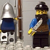
Very nice inn CAI, I love the colours you used. The only thing I'm not so sure about is the smoke. The inside looks nice and crowded. The beggar outside is a nice touch :)
User avatar
Legoredux
Gong Farmer
Posts: 5
Joined: Thu Feb 01, 2007 6:08 am

Post by Legoredux »

Wow! Ye Old Inn is really neat. It has a crowded feal inside and i really like how you put the keg into the wall. How did you get the two roof sections to intersect like that?
User avatar
CastleMann
Villein
Posts: 40
Joined: Fri Sep 28, 2007 4:40 am
Location: Oregon US; Age: 16
Contact:

Post by CastleMann »

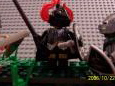
Wow, that is incredible! The details are just amazing! I love all the little scenes and minifigs around, it's just great. Though someone may have already said this, I don't think the smoke looks right from the Inn. But still, a very, VERY good MOC!

Can't wait to see the gatehouse! :D
Coming soon!
Hadrian's Wall - Milecastle

-/[url=http://www.brickshelf.com/cgi-bin/gallery.cgi?m=CastleMann]My old unsorted Brickshelf with lots of junk that needs to be deleted[/url]\-
xD
User avatar
CAI
Journeyman
Posts: 434
Joined: Mon Apr 05, 2004 10:34 pm
Location: NL

Post by CAI »

thanks,

The intersecting roof pieces, I got them on brick link. Here's the Gatehouse, similar to my old one.

http://www.brickshelf.com/cgi-bin/gallery.cgi?f=276252

http://www.brickshelf.com/gallery/Cyin/ ... ateh01.jpg


Cheers.
[url=http://www.brickshelf.com/cgi-bin/gallery.cgi?m=Cyin]Brickshelf Gallery[/url]
User avatar
HeartOfDarkness
Reeve
Posts: 478
Joined: Mon May 07, 2007 5:26 pm
Location: Fortress of Insufficient Light

Post by HeartOfDarkness »

I love the mottled effect you have with the jutting crenellations, 1x1 round pillars, and ocasional dark grey brick. Fantastic!
Count
Freeman
Posts: 91
Joined: Fri Feb 02, 2007 5:10 am
Location: California, USA

Post by Count »

Wow all of this is so spectacular. I cant wait to see it all put together!

-Count
User avatar
Aliencat
Josh's Minion
Posts: 2177
Joined: Wed Jun 20, 2007 3:21 pm
Contact:

Post by Aliencat »

Excellent gatehouse, it completely matches the rest of the castle.
And I must say that's some great piece of photography too, it's so sharp and clean :)
Between plotting to kill you all and chasing balls of yarn, I also build [url=https://www.flickr.com/photos/30639040@N02/albums]MOCs[/url]

[img]http://stopthetrack.com/lego/embassy/alienambassadorpng.png[/img]
User avatar
Escape The Fate
Foot Soldier
Posts: 236
Joined: Mon Jul 02, 2007 4:00 pm
Location: age 16

Post by Escape The Fate »

I love the gate house.
User avatar
shadowknight94
Villein
Posts: 47
Joined: Sun Sep 23, 2007 7:38 pm
Location: In the great castle of you-name-it-land
Contact:

Post by shadowknight94 »

I really like the gatehouse, and how the walls are so large and imposing. I also like how the castle has that "crowded" feel to it. Nice job! :D
____________
Shadowknight94, ruler of you-name-it-land. My brickshelf:

http://www.brickshelf.com/cgi-bin/gallery.c ... owknight94
User avatar
Tower of Iron Will
Master
Posts: 1705
Joined: Fri Aug 17, 2007 3:47 am
Location: Fortress of the Lion Emperor

Post by Tower of Iron Will »

Excellent castle. Great job. Too bad LEGO didn't mass produce these (just an idle thought, semi-serious.)
-Tower
Power corrupts, and absolute power corrupts absolutely!

Despise learning and make everyone pay for your ignorance.

The water that floats a ship is the same that sinks it.

My LEGO figures keep me from being evil, drat!!
Post Reply