CCC XI MOC critiques thread
Re: CCC XI MOC critiques thread
Many thanks for doing it! It's always helpful to read some criticism especially from such experienced AFOL like you.
Can I get feedback on my coast (medieval town category)? Thank you in advance.
Last edited by FanLego on Thu Feb 27, 2014 10:09 pm, edited 1 time in total.
Re: CCC XI MOC critiques thread
Thanks! (Were aloud to post other comments here too right?) Well the one with the knife is cutting the string to release the trap (I think what was misunderstood (Unfortunately) was that it is a trap and as seen, in the photo on the far right, the drivers ended in a hole(which was (in real life)covered by a net.)I wish you had read the story before you judged it (Because you then would have understood it) but I understand you didn't have the time) . Thanks for the critique ! I enjoyed it !Bruce N H wrote: Josdu Drastic end
It was just hard to really get a handle on this one. I think your entry would have been improved if, instead of trying to show flying, crashing, crashed, you had instead just focused on the first 'flying' picture, and used the scared looks on the faces and perhaps the angle of the flying machine to show that they're going down. Also, a separate shot of just the flying machine would have been nice, as it is hard to see how it works. Be careful with fig placement - I have no idea what that fourth fig, the one with the knife, is doing. He seems to be clueless about the contraption about to crash into him.
Anyway, that's my first round of thoughts. I hope those critiques made sense.
Bruce
[url=http://www.flickr.com/photos/98280612@N05/?details=1#]Flickr[/url]
Let [them] see your good works, and glorify your father which is in heaven.
Matthew 5:16
Let [them] see your good works, and glorify your father which is in heaven.
Matthew 5:16
- Ronin Dragonslayer
- Journeyman
- Posts: 422
- Joined: Sun Feb 10, 2013 9:59 pm
- Location: The mountains of Garheim
Re: CCC XI MOC critiques thread
Thanks for doing this, Bruce!
Could you critique this entry for me? It seemed to go completely unnoticed.
Link to the set http://www.flickr.com/photos/94793457@N ... 331648353/
Cheers
Ryan "Ronin" Dragonslayer
Could you critique this entry for me? It seemed to go completely unnoticed.
Link to the set http://www.flickr.com/photos/94793457@N ... 331648353/
Cheers
Ryan "Ronin" Dragonslayer
[img]http://www.brickshelf.com/gallery/lord-of-o ... litia4.jpg[/img][img]http://farm4.staticflickr.com/3834/95487351 ... 3d8e_t.jpg[/img]
[img]http://farm9.staticflickr.com/8464/84137895 ... e1ab_m.jpg[/img]
[img]http://farm9.staticflickr.com/8464/84137895 ... e1ab_m.jpg[/img]
- royalbrickcustoms
- Gentleman
- Posts: 701
- Joined: Mon Sep 24, 2012 6:31 pm
- Location: In the City of Fangroth
- Contact:
Re: CCC XI MOC critiques thread
Hey Bruce,
Thanks for doing this again. Could you please critique (and offer constructive critscism for) my Miscellaneous Category entry?
CCCXI- (LCC): An "Icy" Encounter by RBCustoms on Flickr
Thanks,
~RBC
Thanks for doing this again. Could you please critique (and offer constructive critscism for) my Miscellaneous Category entry?
CCCXI- (LCC): An "Icy" Encounter by RBCustoms on Flickr
Thanks,
~RBC
"I can do all things through Him who strengthens me."
~Phil. 4:13
[url=http://www.bricklink.com/store.asp?p=RBCustoms]Royal Brick Customs Shop (Bricklink)[/url]
~Phil. 4:13
[url=http://www.bricklink.com/store.asp?p=RBCustoms]Royal Brick Customs Shop (Bricklink)[/url]
- Bruce N H
- Precentor of the Scriptorium
- Posts: 6314
- Joined: Mon Sep 15, 2003 9:11 pm
- Location: Middle Zealand
- Contact:
Re: CCC XI MOC critiques thread
Hey all, more comments:
Rifirofi Take your kid to work day
This was hilarious and really made me laugh, especially the suspended brown cone. As to the build, I particularly liked the cart design - very clever way of attaching everything using clips. My main critique is that I thought the wall was too greebled up (especially those upside down fender pieces, which I thought just looked odd). I think it would have been better if the wall was relatively smooth light gray, with then streaks of dark gray and the occasional streak of brown (sorry if anyone is reading this right before dinner). Also, I think you should have continued the wall up out of the frame of the picture.
Justin M Order of the Bull
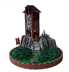
This is a really nice construction. I particularly like the rockscaping and the stone walls of the tower. There were a couple of issues with the tower. For one, it just seems unnecessarily narrow - why would someone build this where they hardly have room to take two steps across the room before they run into the opposite wall? Also, when you look close you see through to the white background behind, which makes it apparent that the tower is a facade. Nothing particularly wrong with a facade when you are only photographing from one angle, but it still shouldn't look like a facade. Mostly, though, I just thought this didn't come across as a 'secret hideout' at all - it just seems like it's sticking up for everyone to see.
Brickninja, here's a link to purchase the 2014 Classic-Castle Calendar.
FanLego Coast of a Northern Lake
Again, this is a nice entry in an extremely strong category. I really like the tree, the arches on the front of the right-hand building, the shape of the beach, and all of the 'life' details. One construction critique is that I thought the tiles on the stone walls of the buildings looked kind of sloppy. I know you were going for more of a rough-hewn look with that, but I think it would be better if most of the tiles were straight, with maybe one or two here and there at slight angles. These are nice homes rather than falling-down ramshackle buildings. The main critique I had here was that I didn't think this fit the 'medieval town' category very well, in that these seemed very rural to me. IMO this almost would have been better as a 'child's life' entry, and then just played up the fig placement a little more to emphasize the kids doing chores, the two playing in the boat, etc.
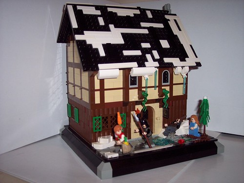
Ronin Dragonslayer Frosted Mug
I thought your entries were a little hot and cold over all - for instance, I really liked your First Snow and Higgitus Figgitus a lot better. This was on okay build, but I didn't really feel the building had something special that really set it apart. My favorite bits were the use of shutter bricks on the sides, the icicles and the guy slipping on the ice - actually the fig placement in general for the outside figures was good. OTOH I thought the snow on the roof was too blocky, and the building would have been more interesting if it wasn't just a straight rectangle shape. Inside I thought it was too brown overall - brown floors, brown furniture, brown walls, brown stairs, figs with brown legs - it just hid a lot of the detail. Also, as with some of the others, I just didn't think this was a good fit for the category. I get that the jester and bard are people who at other times might be involved in court entertainment, but not in this depiction.
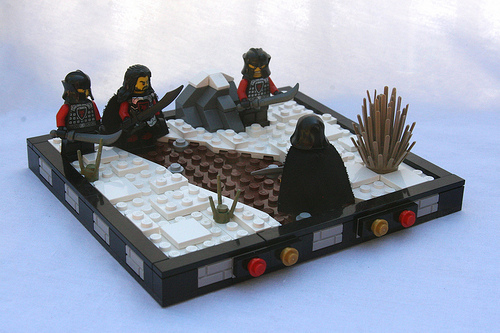
RoyalBrickCustoms Icy Encounter
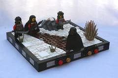
This was a nice little build, but see my comments to Lil_curt above about the issues of a 'nice little build' in the misc category. I liked the shaping in general and the color blocking, also the bit of snow on the rock is a nice touch. I thought it would have been improved if there was a little more verticality to the landscape/snowscape - the ground is apparently perfectly flat, and the snow is all within two plates of the ground. Maybe make the underlying ground slope up a little on either side of the path, and then have the snow drifted higher in a couple of places. Fig placement is pretty good - not a lot of action, but you're going for more of a tense encounter, which comes off fairly well here. You only had two photos - instead I would suggest having one overview as you do, and then two photos each at a figs-eye-view level from two different directions.
Bruce
[url=http://comicbricks.blogspot.com/]ComicBricks[/url] [url=http://godbricks.blogspot.com/]GodBricks[/url] [url=http://microbricks.blogspot.com/]MicroBricks[/url] [url=http://minilandbricks.blogspot.com/]MinilandBricks[/url] [url=http://scibricks.blogspot.com/]SciBricks[/url] [url=http://vignettebricks.blogspot.com/]VignetteBricks[/url] [url=http://www.classic-castle.com/bricktales/]Brick Tales[/url]
- Brickninja
- Here there be dragons
- Posts: 976
- Joined: Mon Nov 04, 2013 9:41 pm
- Location: Roawia!
- Contact:
Re: CCC XI MOC critiques thread
Wait, why a link to the calendar? I wanted critique on my MOC. Was there a mistake or something?
Romans 8:38-39
[url=http://thebricktavern.blogspot.co.uk/]The Brick Tavern[/url] [url=http://www.flickr.com/photos/110008680@N03/]Flickr[/url]
[img]http://www.brickshelf.com/gallery/lord-of-o ... tizen4.jpg[/img]
[img]http://www.brickshelf.com/gallery/t-est/LCC ... eroes2.jpg[/img]
[url=http://thebricktavern.blogspot.co.uk/]The Brick Tavern[/url] [url=http://www.flickr.com/photos/110008680@N03/]Flickr[/url]
[img]http://www.brickshelf.com/gallery/lord-of-o ... tizen4.jpg[/img]
[img]http://www.brickshelf.com/gallery/t-est/LCC ... eroes2.jpg[/img]
Re: CCC XI MOC critiques thread
Hi Bruce,
Thanks for taking (even more) time to go through and critique entries and provide feedback. This was the first time I've tried something for the "castle" category and really my first large-scale castle. I would appreciate any input on how I could have improved it. Thanks!
Contest only pictures
Full Res set that includes more pictures
[url=http://www.flickr.com/photos/62171882@N00/]Flickr[/url]
[url=http://www.mocpages.com/home.php/4729]Mocpages[/url]
[url=http://www.mocpages.com/home.php/4729]Mocpages[/url]
- AK_Brickster
- Admin
- Posts: 3476
- Joined: Wed Jun 22, 2011 5:02 pm
- Location: Mushing through the Great Driftplains of Garheim
- Contact:
Re: CCC XI MOC critiques thread
Lol. That's Bruce's way of reminding you that the rule is "one feeback per week." You requested feedback on Feb 26th and again on Feb 27th, so maybe a calendar would help you remember how many days are in a weekBrickninja wrote:Wait, why a link to the calendar? I wanted critique on my MOC. Was there a mistake or something?
- Brickninja
- Here there be dragons
- Posts: 976
- Joined: Mon Nov 04, 2013 9:41 pm
- Location: Roawia!
- Contact:
Re: CCC XI MOC critiques thread
Oh, sorry. I guess I misread and misunderstood it.
Romans 8:38-39
[url=http://thebricktavern.blogspot.co.uk/]The Brick Tavern[/url] [url=http://www.flickr.com/photos/110008680@N03/]Flickr[/url]
[img]http://www.brickshelf.com/gallery/lord-of-o ... tizen4.jpg[/img]
[img]http://www.brickshelf.com/gallery/t-est/LCC ... eroes2.jpg[/img]
[url=http://thebricktavern.blogspot.co.uk/]The Brick Tavern[/url] [url=http://www.flickr.com/photos/110008680@N03/]Flickr[/url]
[img]http://www.brickshelf.com/gallery/lord-of-o ... tizen4.jpg[/img]
[img]http://www.brickshelf.com/gallery/t-est/LCC ... eroes2.jpg[/img]
-
- Geoffrey of Monmouth
- Posts: 81
- Joined: Sat Nov 22, 2008 9:12 pm
Re: CCC XI MOC critiques thread
Hi Bruce,
I'd like to have some critique on my castle entry:
http://www.flickr.com/photos/kumpelkant ... 088884043/
Thanks in advance and have a nice day
I'd like to have some critique on my castle entry:
http://www.flickr.com/photos/kumpelkant ... 088884043/
Thanks in advance and have a nice day
Re: CCC XI MOC critiques thread
Hey, could i get this one critiqued?
My FLickr [url]http://www.flickr.com/photos/67866231@N02/[/url]
- royalbrickcustoms
- Gentleman
- Posts: 701
- Joined: Mon Sep 24, 2012 6:31 pm
- Location: In the City of Fangroth
- Contact:
Re: CCC XI MOC critiques thread
Hey Bruce,
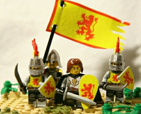
Could you critique my my entry to the Custom Faction category, too?
CCCXI- (Loreos LCXIII): Roaring Lions by RBCustoms on Flickr
~RBC
Could you critique my my entry to the Custom Faction category, too?
CCCXI- (Loreos LCXIII): Roaring Lions by RBCustoms on Flickr
~RBC
"I can do all things through Him who strengthens me."
~Phil. 4:13
[url=http://www.bricklink.com/store.asp?p=RBCustoms]Royal Brick Customs Shop (Bricklink)[/url]
~Phil. 4:13
[url=http://www.bricklink.com/store.asp?p=RBCustoms]Royal Brick Customs Shop (Bricklink)[/url]
- Luke the Swift~
- Bailiff
- Posts: 327
- Joined: Mon Feb 18, 2013 9:28 pm
- Location: Lenfald
Re: CCC XI MOC critiques thread
Hello! I checked and, there was nothing in the rules against this. I hope I don't get in trouble! I was wondering if you could simply, give me some feed back on this build. The catch is....It was not an entry to the CCC. It was just a free-build. If you can please do but, if you feel you don't have the time to spend critiquing a free-build then I totally understand. Anywho! Here it is!
The link!!
http://www.mocpages.com/moc.php/381783
The link!!
http://www.mocpages.com/moc.php/381783
[img]http://images.mocpages.com/user_images/71646/1384380205m_SPLASH.jpg[/img]
Re: CCC XI MOC critiques thread
for this week bruce I would like a critique on this one,
http://smg.photobucket.com/user/curtw_9 ... t=3&page=1
Thanks for your time,
Curt
http://smg.photobucket.com/user/curtw_9 ... t=3&page=1
Thanks for your time,
Curt
So Many Hobbies So Little Time....
Come Visit me on Facebook @ Atavistic Creations